NativeScriptアプリのCSSテーマ
NativeScriptのスタイリングインフラストラクチャにより、Web上のBootstrapのようなフレームワークを使用するのと同じように、ネイティブアプリケーション用にCSSテーマを作成して使用することができます。
NativeScriptプロジェクトは、任意のプロジェクトに追加できるコアテーマを提供します。 テーマには、明るい色と暗い色の2つの配色と、エレガントなユーザーインターフェイスをすばやく構築するのに役立つ一連の便利なクラス名が含まれています。
インストール
公式のNativeScriptテンプレートにはすべて、NativeScriptコアテーマがあらかじめパッケージ化されており、すぐに使用できるため、手動でインストールする必要はありません。 何らかの理由でテーマがプリインストールされていないアプリを使用している場合は、次のコマンドで追加できます。
npm install nativescript-theme-core --save
あなたのapp.cssファイルは、あなたのアプリでテーマを使用するためにCSSルール@importが必要です。これは次のセクションで学びます。
配色
NativeScriptコアテーマには、明るい色と暗い色の2つの標準的な配色が含まれています。Android(左)とiOS(右)での外観は次のとおりです。
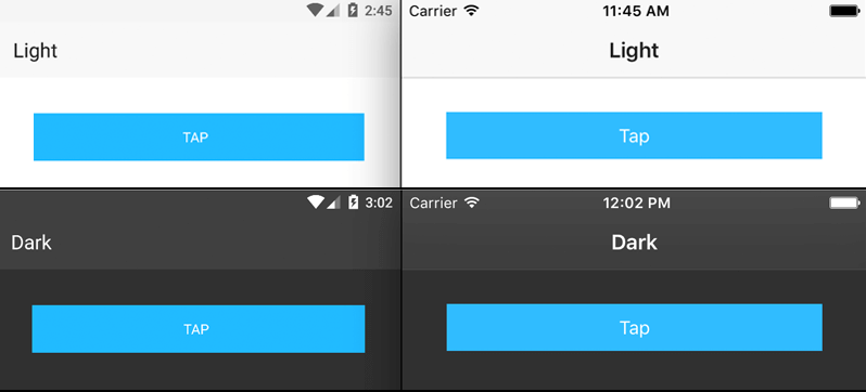
明るい配色を使用するには、app.cssファイルの先頭に次のコード行を追加します。
@import '~nativescript-theme-core/css/core.light.css';暗い配色を使用するには、app.cssに次のコード行を追加します。
@import '~nativescript-theme-core/css/core.dark.css';- "page"クラス名を適用して、アプリのテキストが適切に表示されるようにします。
- アプリのステータスバーの色を変更します。
- Androidで暗い親テーマを使用するには、App_Resources\Android\values[-v21]フォルダのstyle.xmlファイル内にある
"parent"属性からLightを削除します。(例えば、
Theme.AppCompat.Light.NoActionBarはTheme.AppCompat.NoActionBarになります)
また、NativeScriptコアテーマに含まれる11のその他の配色のいずれかを使用することもできます。 これを行うには、app.cssファイルを、次のインポートのいずれかを使用するように変更します。
@import '~nativescript-theme-core/css/aqua.css';
@import '~nativescript-theme-core/css/blue.css';
@import '~nativescript-theme-core/css/brown.css';
@import '~nativescript-theme-core/css/forest.css';
@import '~nativescript-theme-core/css/grey.css';
@import '~nativescript-theme-core/css/lemon.css';
@import '~nativescript-theme-core/css/lime.css';
@import '~nativescript-theme-core/css/orange.css';
@import '~nativescript-theme-core/css/purple.css';
@import '~nativescript-theme-core/css/ruby.css';
@import '~nativescript-theme-core/css/sky.css';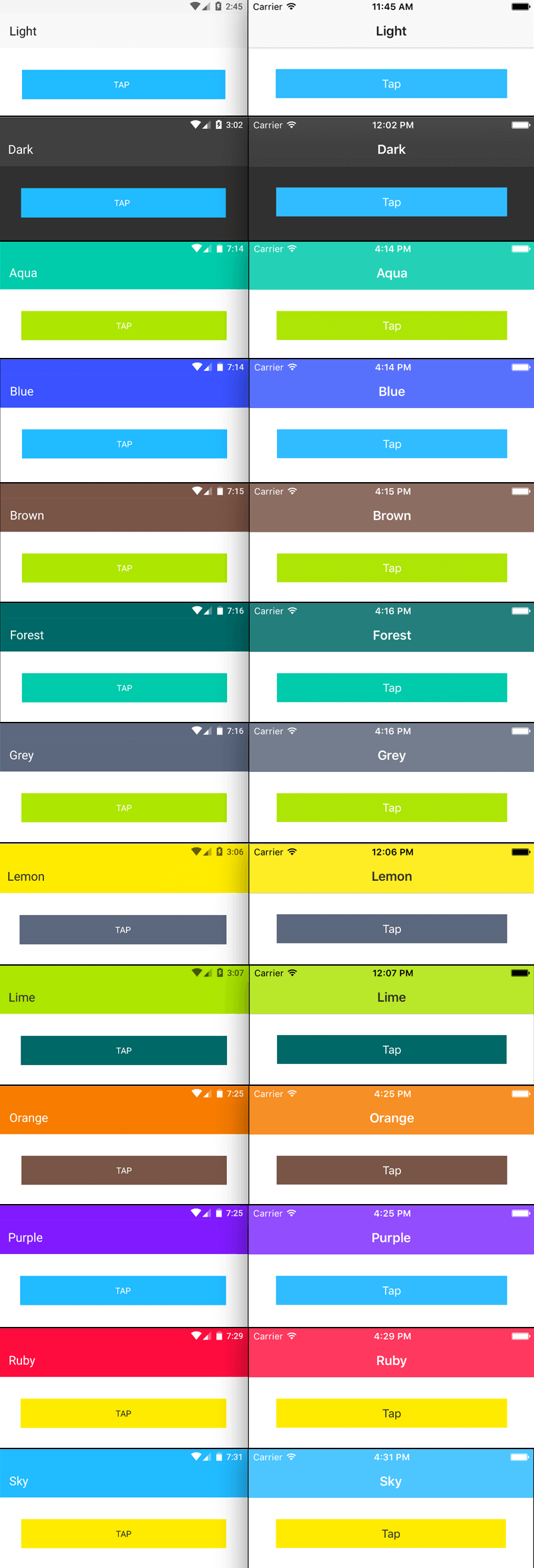
クラス名
NativeScriptコアテーマには、アプリケーションのスタイルをすばやく設定するために使用できるさまざまなCSSクラス名が含まれています。クラス名とその機能の完全なリストを以下に示します。
Headings
次の見出しクラス名を使用して、Web上の要素<h1>または<h2>要素を使用するのと同じように、見出しを作成できます。
- h1
- h2
- h3
- h4
- h5
- h6
これらのクラス名を使用する方法の例をいくつか示します。
<Label class="h1" text="This is a big heading"></Label>
<Label class="h6" text="This is a small heading"></Label>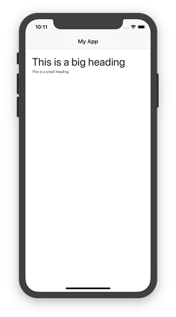
Text
アプリケーションで使用するテキストの表示を変更するために、以下のユーティリティクラス名を使用できます。
-
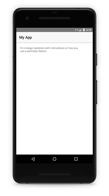
body:段落テキストなど、アプリ内の長文用のクラス名。<Label class="body" text="I’m a longer sentence with instructions on how you use a particular feature" textWrap="true"></Label>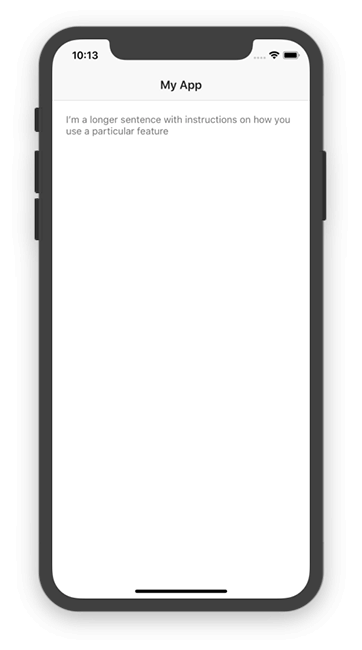
-
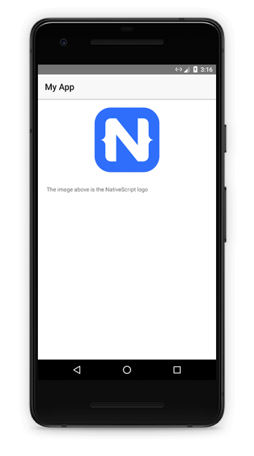
footnote:指定されたUI要素のテキストサイズを縮小するクラス名。アプリの画像やその他の機能を説明する脚注に役立ちます。<Image src="https://play.nativescript.org/dist/assets/img/NativeScript_logo.png" width="150" class="m-b-30"></Image> <Label class="footnote" text="The image above is the NativeScript logo"></Label>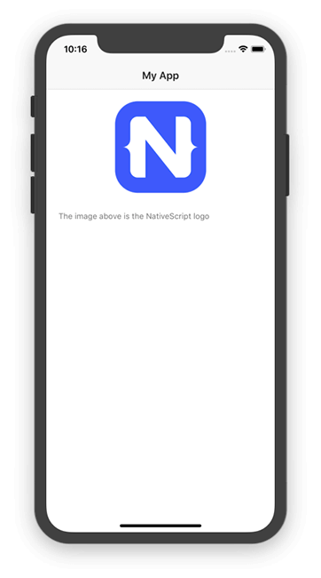
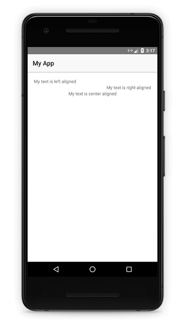
text-left:UI要素にtext-align: leftを適用するクラス名。text-right:UI要素にtext-align: rightを適用するクラス名。text-center:UI要素にtext-align: centerを適用するクラス名。<Label class="text-left" text="My text is left aligned"></Label> <Label class="text-right" text="My text is right aligned"></Label> <Label class="text-center" text="My text is center aligned"></Label>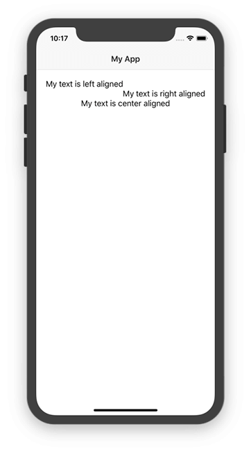
- text-lowercase:指定されたUI要素のテキスト内のすべての文字を小文字にするクラス名。たとえば、<Label class="text-lowercase" text="HI">は「hi」と表示されます。
- text-uppercase:指定されたUI要素のテキスト内のすべての文字を大文字にするクラス名。たとえば、<Label class="text-uppercase" text="hi">は「HI」と表示されます。
- text-capitalize:指定されたUI要素のテキストの最初の文字を大文字にするクラス名。たとえば、<Label class="text-capitalize" text="hi">は「Hi」と表示されます。
フォント
NativeScriptコアテーマは、アプリの開発に使用するベースフォントファミリを変更しません。ただし、テーマは一連のフォント関連のクラス名を提供します。
-
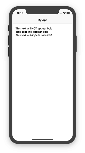
font-weight-normal:通常(normal)のフォントの太さ(font-weight)でフォントを表示するクラス名。<Label class="font-weight-normal" text="This text will NOT appear bold"></Label> -
font-weight-bold:太字(bold)の太さ(font-weight)でフォントを表示するクラス名。<Label class="font-weight-bold" text="This text will appear bold"></Label> -
font-italic:斜体(italic)でフォントを表示するクラス名。<Label class="font-italic" text="This text will appear italicized"></Label>

Padding と Margin
アプリケーション内のUIコンポーネントの間隔を制御するために、多くのクラス名を使用できます。 クラス名の最初のセットを使用すると、特定のUIコンポーネントにマージンまたはパディングをすばやく追加できます。
クラス名は、margin/padding - top/bottom/left/right - 値 の規則に従います。
たとえば、<Button class = "mt-2">はmargin-topが2のボタンをレンダリングし、
<Button class = "pb-5">はpadding-bottomが5のボタンをレンダリングします。
以下は利用可能なクラス名の完全なリストと、それらが出力するルールです。
これらの各ルールでは、「m」を「p」と交換してパディングを適用できます。 これらのルールは、0、2、5、10、15、20、25、30の各値で使用できます。したがって、m-r-0およびm-r-2は有効なクラス名ですが、 m-r-8はそうではありません。
m-0 = { margin:0 }m-t-0 = { margin-top:0 }m-r-0 = { margin-right:0 }m-b-0 = { margin-bottom:0 }m-l-0 = { margin-left:0 }m-x-0 = { margin-right:0; margin-left:0 }m-x-auto = { horizontal-align: center }m-y-0 = { margin-top:0; margin-bottom:0 }
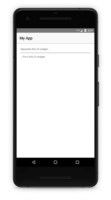
仕切り線
仕切り線は、ユーザーインターフェイスの領域を分離する一般的な方法です。 NativeScriptには2つのクラス名が用意されており、空の<StackLayout>要素に適用して高さが 1 の単純な仕切りを作成できます。
hr-light:明るい色の仕切りを作成します。<Label text="Separate this UI widget..."></Label> <StackLayout class="hr-light m-10"></StackLayout> <Label text="...from this UI widget."></Label>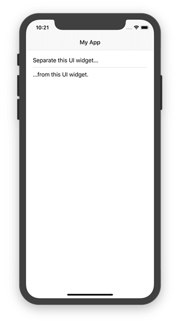

hr-dark:暗い色の仕切りを作成します。<Label text="Separate this UI widget..."></Label> <StackLayout class="hr-dark m-10"></StackLayout> <Label text="...from this UI widget."></Label>
ユーティリティ
NativeScriptコアテーマは、アプリケーションのUIコンポーネントに適用できるユーティリティクラス名のセットを提供します。
pull-left:コンテナの左側にテキストを引き寄せるクラス名。pull-right:テキストをコンテナの右側に引き寄せるクラス名。<StackLayout> <Label class="pull-left font-weight-bold" text="Left!"></Label> </StackLayout> <StackLayout> <Label class="pull-right font-weight-bold" text="Right!"></Label> </StackLayout>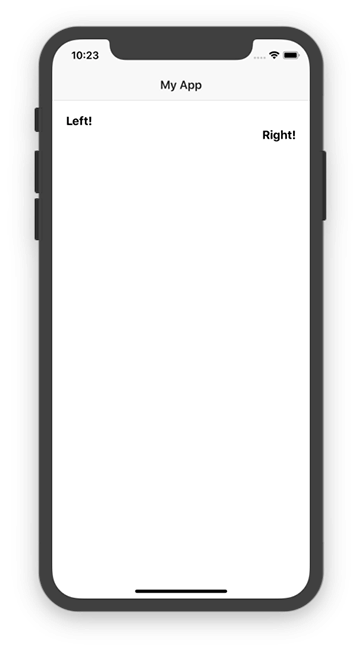

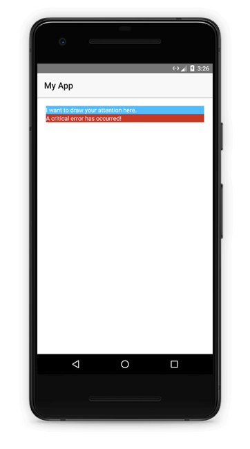
コンテキストカラー
NativeScriptコアテーマに含まれているいくつかのユーティリティクラスを使用して、色で意味を伝えることができます。
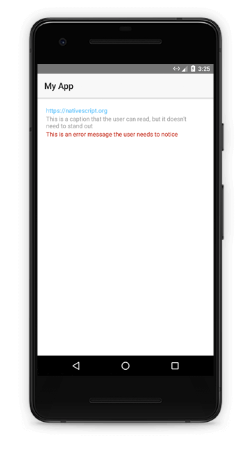
text-primary:テキストをアクティブまたはクリック可能として表示するクラス名。text-muted:キャプションや情報メッセージなど、テキストを控えめに表示するクラス名。text-danger:エラーなどのコンポーネントのテキストを際立たせるクラス名。<Label class="text-primary" text="https://nativescript.org"></Label> <Label class="text-muted" text="This is a caption that the user can read, but it doesn’t need to stand out" textWrap="true"></Label> <Label class="text-danger" text="This is an error message the user needs to notice" textWrap="true"></Label>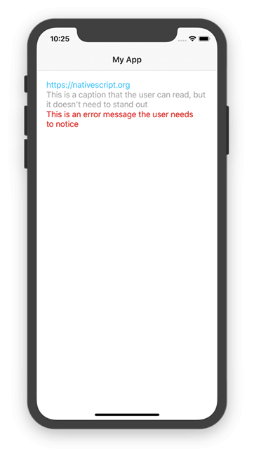
bg-primary:テーマの主要な背景色を適用するクラス名。bg-danger:テーマの危険色を適用するクラス名。<StackLayout class="bg-primary"> <Label text="I want to draw your attention here."></Label> </StackLayout> <StackLayout class="bg-danger"> <Label text="A critical error has occurred!"></Label> </StackLayout>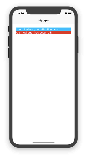
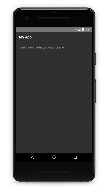
ページ
NativeScriptコアテーマには、ページUIコンポーネントに適用する単一のクラス名が含まれています。
page:暗い配色を使用するときにテキストの色を変更するクラス名。<Page class="page"> <Label class="body" text="I will show up in the dark color scheme."></Label> </Page>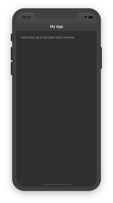
- 注釈:pageクラス名をページのトップレベルレイアウトコンテナに適用することもできます(例:
<GridLayout class="page">...</GridLayout>)。 これは、<Page>コンポーネントが component markup に含まれていないAngularアプリで役立ちます。
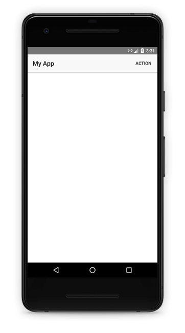
ActionBar
NativeScriptコアテーマには、ActionBar UIコンポーネントに適用するいくつかのクラス名が含まれています。
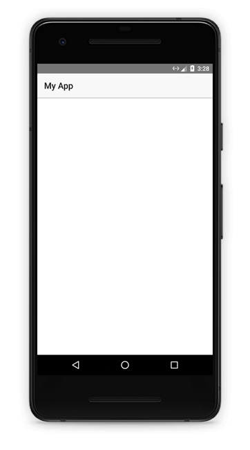
action-bar:テーマの配色をActionBarコンポーネントに適用するクラス名。<Page class="page"> <Page.actionBar> <ActionBar class="action-bar" title="My App"> </ActionBar> </Page.actionBar> </Page>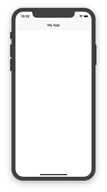
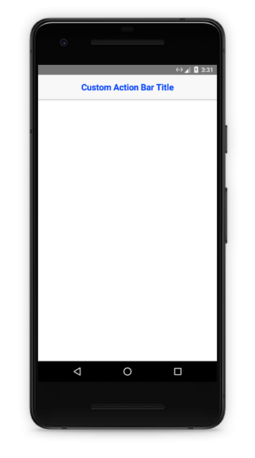
action-bar-title:カスタムタイトルビューを使用するときにテーマの配色を適用するクラス名。<Page class="page"> <Page.actionBar> <ActionBar class="action-bar"> <StackLayout class="action-bar-title"> <Label text="Your App" class="font-weight-bold" color="blue"></Label> </StackLayout> </ActionBar> </Page.actionBar> </Page>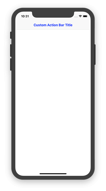
action-item:テーマの配色をカスタムActionItem UIコンポーネントに適用するクラス名。<Page class="page"> <Page.actionBar> <ActionBar class="action-bar" title="My App"> <ActionBar.actionItems> <ActionItem> <ActionItem.actionView> <Button text="Action" class="action-item"></Button> </ActionItem.actionView> </ActionItem> </ActionBar.actionItems> </ActionBar> </Page.actionBar> </Page>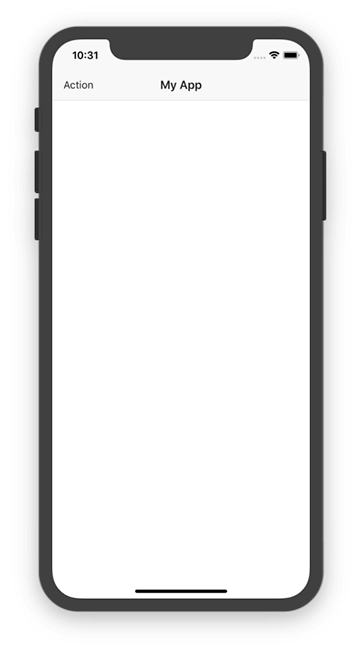
<GridLayout rows="auto" columns="75,*,75" class="action-bar p-10">
<Button text="Close" class="text-left action-item" row="0" col="0"></Button>
<Label text="My Modal" class="text-center action-bar-title" row="0" col="1"></Label>
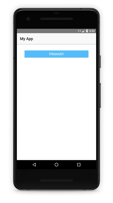
</GridLayout>ボタン
NativeScriptテーマには、アプリケーションのボタンの外観を変更するための幾つかのクラス名が含まれています。
btn:寸法や間隔など、NativeScriptコアテーマの基本スタイルを適用するクラス名。btn-primary:テーマのプライマリカラーパターンをボタンに適用するクラス名。<Button class="btn btn-primary" text="Primary"></Button>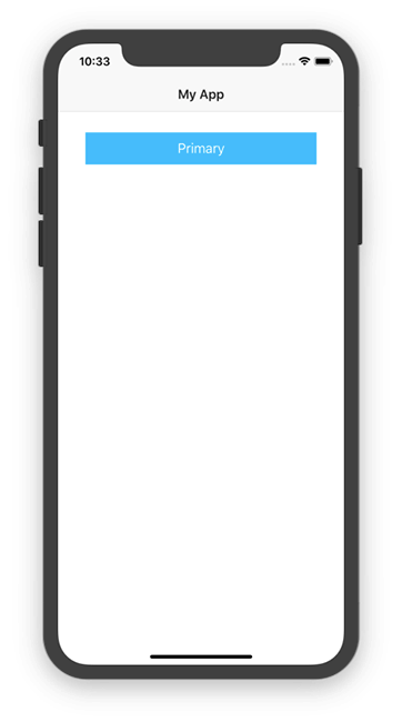
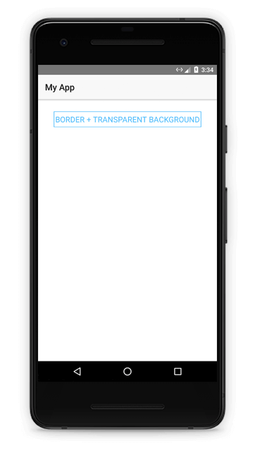
btn-outline:ボタンを境界線と透明な背景で表示するクラス名。<Button class="btn btn-outline" text="Border + Transparent Background"></Button>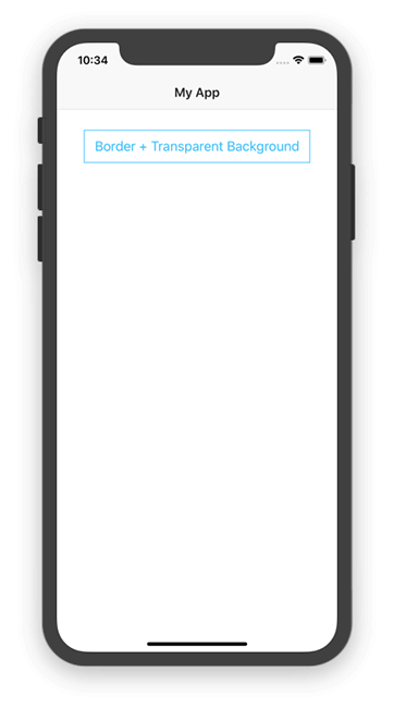
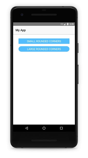
btn-rounded-sm:ボタンを小さな丸い角で表示するクラス名。btn-rounded-lg:ボタンを大きく丸い角で表示するクラス名。<Button class="btn btn-primary btn-rounded-sm" text="Small rounded corners"></Button> <Button class="btn btn-primary btn-rounded-lg" text="Large rounded corners"></Button>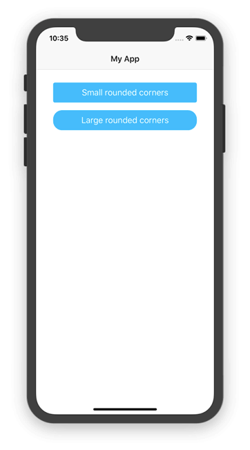
btn-active:タップするとボタンが強調表示されるクラス名。<Button class="btn btn-active" text="I’m highlighted when tapped"></Button>
フォーム
次のフォーム関連のクラス名を使用して、NativeScriptアプリのフォームの外観を改善できます。
form:フォームのメインコンテナとして機能するレイアウトコンテナにスペースを追加するクラス名。<StackLayout class="form"> <!-- The contents of the form --> </StackLayout>
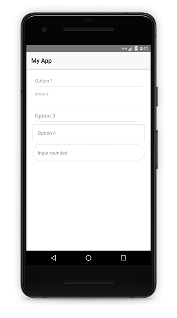
フォーム内の個々のフォームフィールドを表示する方法はいくつかあります。以下のクラス名のリストを参照し、実際に動作させる中で、実行時のクラス名を確認してください。
input:TextField UIコンポーネントに基本スタイルを適用するクラス名。input-border:TextField UIコンポーネントに境界線を追加するクラス名。input-rounded:丸い境界線をTextField UIコンポーネントに追加するクラス名。label:基本スタイルをLabel UIコンポーネントに適用するクラス名。input-field:親コンテナに適用して、ラベルを対応するTextField UIコントロールに揃えることができるクラス名。input-sides:ラベルとテキストフィールドを並べて配置するのに役立つクラス名。
以下に、さまざまなフォームコントロールの表示オプションを試してみることのできるフォームを示します。
<StackLayout class="form">

	<!-- Option 1: An input with no label, and a bottom border -->
	<StackLayout class="input-field">
		<TextField hint="Option 1" class="input" />
		<StackLayout class="hr-light"></StackLayout>
	</StackLayout>

	<!-- Option 2: An input with a label on top, and a bottom border -->
	<StackLayout class="input-field">
		<Label text="Option 2" class="label font-weight-bold m-b-5" />
		<TextField class="input" />
		<StackLayout class="hr-light"></StackLayout>
	</StackLayout>

	<!-- Option 3: An label and input—positioned side by side -->
	<GridLayout class="input-field input-sides" rows="auto, auto" columns="*,*">
		<Label text="Option 3" class="label font-weight-bold" row="0" col="0" />
		<TextField class="input right" row="0" col="1" />
		<StackLayout class="hr-light" row="1" colSpan="2"></StackLayout>
	</GridLayout>

	<!-- Option 4: An input with a simple border and no label -->
	<TextField hint="Option 4" class="input input-border" />

	<!-- Option 5: An input with a rounded border and no label -->
	<TextField hint="Input rounded" class="input input-rounded m-t-10" />

</StackLayout>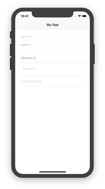
<TextField class="input" isEnabled="false"></TextField>
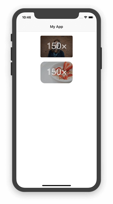
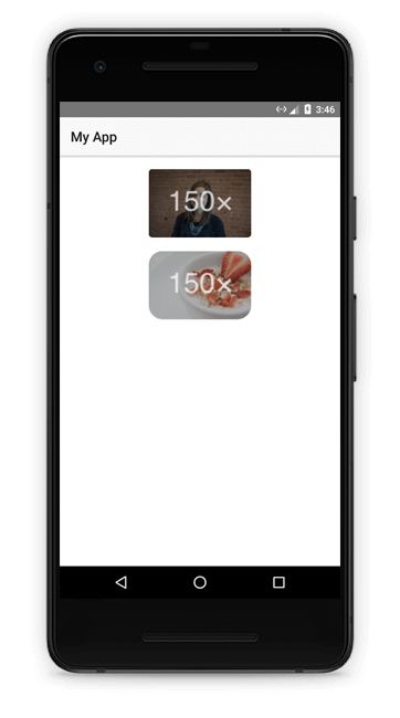
画像
NativeScriptコアテーマには、画像の外観を変更するためのCSSクラス名がいくつか用意されています。
img-rounded:イメージUIコンポーネントに小さいborder-radiusを適用するクラス名。img-circle:イメージUIコンポーネントに大きいborder-radiusを適用し、イメージを円として表示するクラス名。<Image src="https://placem.at/people?w=150" width="150" class="img-rounded m-b-20"></Image> <Image src="https://placem.at/things?w=150" width="150" class="img-circle"></Image>
リストビュー
ListViewは、モバイルアプリの一般的なUIコンポーネントであり、NativeScriptコアテーマは一連のクラス名を提供してリストビューを美しく見せます。
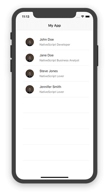
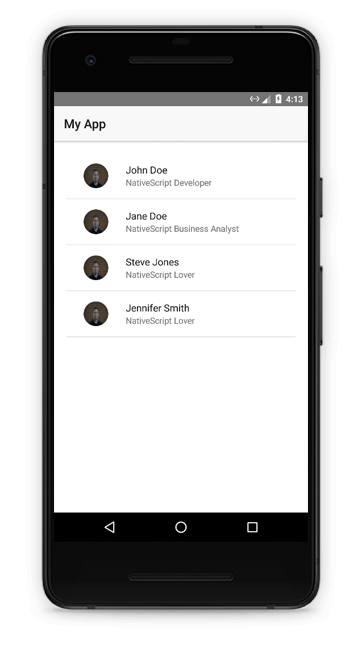
list-group:後続のクラス名のいずれかでスタイルするListView UIコンポーネントに適用するクラス名。<ListView class="list-group"> <!-- The contents of the ListView --> </ListView>list-group-item:各アイテムテンプレートのコンテナ(通常はスタックまたはグリッドレイアウト)に適用するクラス名。クラス名は、少しの間隔とテーマの配色を追加します。<ListView class="list-group"> <ListView.itemTemplate> <GridLayout class="list-group-item"> <!-- The contents of the template --> </GridLayout> </ListView.itemTemplate> </ListView>list-group-item.active:ユーザーに際立たせたいリストビュー項目にactiveクラス名を適用します。 このクラス名は条件付きで適用することになるでしょう。<ListView class="list-group"> <ListView.itemTemplate> <GridLayout class="list-group-item active"> <!-- The contents of the template --> </GridLayout> </ListView.itemTemplate> </ListView>list-group-item.thumb:thumbクラス名を使用してサムネイル画像をリストビュー項目に追加します。<ListView class="list-group"> <ListView.itemTemplate> <GridLayout class="list-group-item" rows="*" columns="auto, *"> <Image row="0" col="0" src="..." class="thumb img-circle"></Image> <Label row="0" col="1" text="Your text"></Label> </GridLayout> </ListView.itemTemplate> </ListView>list-group-item-heading:複数行のアイテムテンプレートで見出しとして表示される要素に適用するクラス名。list-group-item-textクラス名と組み合わせて使用します。list-group-item-text:複数行のアイテムテンプレート内の本文に適用するクラス名。<ListView class="list-group"> <ListView.itemTemplate> <GridLayout class="list-group-item" rows="auto, *" columns="80, *"> <Image row="0" col="0" src="https://placem.at/people?w=80&txt=0" class="thumb img-circle" rowSpan="2"></Image> <Label row="0" col="1" text="" class="list-group-item-heading" /> <Label row="1" col="1" text="" class="list-group-item-text" /> </GridLayout> </ListView.itemTemplate> </ListView>
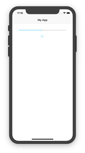
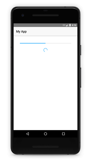
プログレスバーとアクティビティインジケーター
次のクラス名を使用して、NativeScriptコアテーマのカラースキームをProgressおよびActivityIndicator UIコンポーネントに適用できます。
progress:コアテーマの配色をProgress UIコンポーネントに適用するためのクラス名。activity-indicator:コアテーマの配色をActivityIndicator UIコンポーネントに適用するためのクラス名。<Progress class="progress m-20" value="50"></Progress> <ActivityIndicator class="activity-indicator" busy="true"></ActivityIndicator>
SideDrawers(横からスライドするメニュー)
SideDrawersは、NativeScriptアプリにナビゲーションを実装する一般的な方法です。 NativeScriptコアテーマには、NativeScript UIコンポーネントスイートの一部である無料で使用できる RadSideDrawerのスタイル設定に役立つクラス名が含まれています。
最初の2つのSideDrawersクラス名は、SideDrawers内のコンテンツの配置を制御します。
sidedrawer-center:コンテンツを中央に揃えるクラス名。sidedrawer-left:画面の左側にコンテンツを配置するクラス名。<StackLayout class="sidedrawer-center"> <!-- Contents of the sidedrawer --> </StackLayout> <StackLayout class="sidedrawer-left"> <!-- Contents of the sidedrawer --> </StackLayout>sidedrawer-header:サイドドロワーのセクションをヘッダーとして指定するクラス名。アプリのドロワーナビゲーションの上に画像またはロゴを表示する場合に便利です。<StackLayout class="sidedrawer-left"> <StackLayout class="sidedrawer-header"> <!-- The contents of the header --> </StackLayout> </StackLayout>sidedrawer-header-image:サイドドロワーヘッダー内に表示する画像またはロゴに適用するクラス名。テーマは、画像の位置合わせを行います。sidedrawer-header-brand:サイドドロワーのヘッダーに表示されるテキスト見出しに適用するクラス名。<StackLayout class="sidedrawer-left"> <StackLayout class="sidedrawer-header"> <Image class="sidedrawer-header-image img-circle" src="~/my-app-logo.png"></Image> <Label class="sidedrawer-header-brand" text="Name of My App"></Label> </StackLayout> </StackLayout>sidedrawer-content:サイドドロワーのセクションをメインコンテンツとして指定するために使用されるクラス名。このセクションは通常、ナビゲーションリンクのリストを表示するために使用されます。<StackLayout class="sidedrawer-left"> <StackLayout class="sidedrawer-header">...</StackLayout> <StackLayout class="sidedrawer-content">...</StackLayout> </StackLayout>sidedrawer-list-item:サイドドロワーのコンテンツ内に表示される個々のアイテムまたはリンクに適用されるクラス名。sidedrawer-list-item-text:各サイドドローアのリストアイテム内で使用されるテキストに適用するクラス名。sidedrawer-list-item-icon:各リスト項目のテキストの横にアイコンを表示するために使用できるクラス名。<StackLayout class="sidedrawer-left"> <StackLayout class="sidedrawer-header"> <!-- The contents of the header --> </StackLayout> <StackLayout class="sidedrawer-content"> <!-- A list item with no icon --> <GridLayout class="sidedrawer-list-item" rows="*" columns="*"> <Label row="0" col="0" text="A Link"></Label> </GridLayout> <!-- A list item with an icon --> <GridLayout class="sidedrawer-list-item" rows="auto" columns="auto, *"> <Image class="sidedrawer-list-item-icon" row="0" col="0" src="~/path/to/icon.png"></Image> <Label class="sidedrawer-list-item-text" row="0" col="1" text="A Link"></Label> </GridLayout> </StackLayout> </StackLayout>
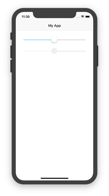
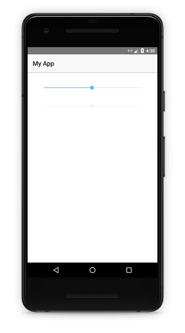
スライダー
NativeScriptコアテーマには、Slider UIコンポーネントのスタイルを設定するためのクラス名が含まれています。
slider:テーマの配色をスライダーに適用するクラス名。クラス名は、スタイリングが無効なスライダーコントロールを処理します。<Slider minValue="1" maxValue="100" value="50" class="slider"></Slider> <Slider minValue="1" maxValue="100" value="50" class="slider" isEnabled="false"></Slider>
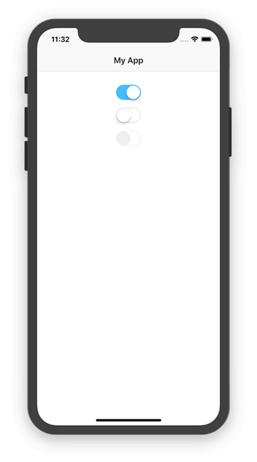
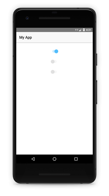
スイッチ
NativeScriptコアテーマには、Switch UIコンポーネントのスタイル設定用のクラス名も含まれています。
switch:テーマの配色をスイッチに適用するクラス名。クラス名は、スタイリングが無効なスイッチコントロールを処理します。<Switch checked="true" class="switch" horizontalAlignment="center"></Switch> <Switch checked="false" class="switch" horizontalAlignment="center"></Switch> <Switch checked="false" class="switch" isEnabled="false" horizontalAlignment="center"></Switch>
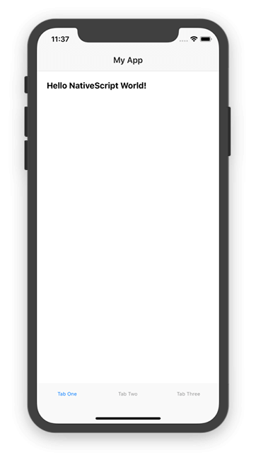
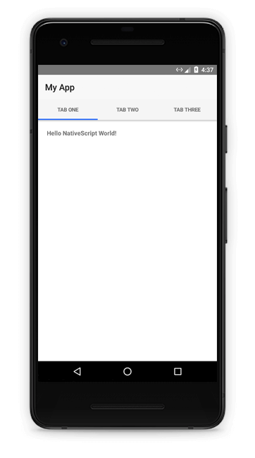
タブビュー
NativeScriptコアテーマには、TabView UIコントロールのスタイルを設定するためのクラス名が含まれています。
tab-view:テーマの配色をTabViewsに適用するクラス名。<TabView> <TabView.items> <TabViewItem title="Tab One"> <TabViewItem.view> <StackLayout class="p-20"> <Label text="Hello NativeScript World!" class="font-weight-bold" /> </StackLayout> </TabViewItem.view> </TabViewItem> <TabViewItem title="Tab Two"> <TabViewItem.view> <StackLayout class="p-20"> <Label text="Hi! I'm Tab Two's Content!" class="font-weight-bold" /> </StackLayout> </TabViewItem.view> </TabViewItem> <TabViewItem title="Tab Three"> <TabViewItem.view> <StackLayout class="p-20"> <Label text="Howdy! Welcome to Tab Three!" class="font-weight-bold" /> </StackLayout> </TabViewItem.view> </TabViewItem> </TabView.items> </TabView>
SASSの使用
NativeScriptコアテーマはSASSで記述されており、(オプションで)テーマの.scssファイルを直接使用できます。 SASSを使用すると、テーマのSASS変数を使用してアプリの外観を変更するなど、CSSでは不可能な方法でテーマをカスタマイズできます。
利用を始めるにあたっては、最初にアプリにSASSコンパイラ(node-sass または dart-sass)があることを確認してください。
npm install node-sass --save-dev新しいプロジェクトでは、SASSが事前に有効化されたテンプレートを使用できます。 公式にサポートされているテンプレートの完全なリストは、App Templates GitHubリポジトリ にあります。
tns create my-new-project --template tns-template-drawer-navigation-tsSASSをセットアップして使用する準備ができたら、次にテーマの.scssファイルを自分のファイルにインポートする必要があります。 アプリで次のファイルを作成することから始めます。
.
├── _app-common.scss
├── _app-variables.scss
├── app.android.scss
└── app.ios.scssその後、次のコードをapp.android.scssファイルに貼り付けます。
// Import app variables
@import 'app-variables';

// Import the theme’s main ruleset - both index and platform specific.
@import '~nativescript-theme-core/scss/index';
@import '~nativescript-theme-core/scss/platforms/index.android';

// Import common styles
@import 'app-common';

// Place any CSS rules you want to apply only on Android hereそして、次のコードをapp.ios.scssファイルに追加します。
// Import app variables
@import 'app-variables';

// Import the theme’s main ruleset - both index and platform specific.
@import '~nativescript-theme-core/scss/index';
@import '~nativescript-theme-core/scss/platforms/index.ios';

// Import common styles
@import 'app-common';

// Place any CSS rules you want to apply only on iOS here次の内容で_app-variables.scssを作成します。
// Import the theme’s variables. If you’re using a color scheme
// other than “light”, switch the path to the alternative scheme,
// for example '~nativescript-theme-core/scss/dark'.
@import '~nativescript-theme-core/scss/light';

// Customize any of the theme’s variables here, for instance $btn-color: red;最後に、次のコードを_app-common.scssファイルに貼り付けます。
// Place any CSS rules you want to apply on both iOS and Android here.
// This is where the vast majority of your CSS code goes.このアプローチの利点は、テーマのSASS変数を直接カスタマイズできることです。 プラットフォームごとにアプリのスタイルを変える必要がある場合は、iOS固有のコードとAndroid固有のコード用に個別のファイルを設定することもできます。
カスタム.scssファイルを使用する
NativeScript AngularプロジェクトでSASSを使用しており、.scss特定のコンポーネント用のカスタムファイルがある場合は、 以下のサンプルコードスニペットに示すように、コンポーネントのtypescriptファイル内のstyleUrlsで、.scssファイルへのパスを参照する必要があります。例えば:
ファイル構造:
.
├── custom.scss
├── custom.css
└── app.component.ts
component.ts
import { Component } from "@angular/core";

@Component({
selector: "ns-app",
templateUrl: "app.component.html",
styleUrls:["./custom.scss"]
})
export class AppComponent { }
ステータスバーの考慮事項
NativeScriptコアテーマを使用する場合、ステータスバーで使用する色を変更して、アプリケーションの残りの部分と一致させることができます。
iOS
iOSでは、ステータスバーの色を次の2つの値のいずれかに設定できます。
UIBarStyleDefault: デフォルトの黒いテキストを使用します。
UIBarStyleBlack:白いテキストを使用する代替オプションです。
NativeScriptコアテーマの目的のために、iOSでステータスバーの色を変更する必要があるのは、暗い配色を使用している場合のみです。
もし必要であれば、ステータスバーの色をUIBarStyleBlackに変更する方法に関するドキュメントを参照してください。
アンドロイド
Android APIレベル21+(Lollipop以上)を使用すると、好きな色を使用するようにステータスバーを設定できます。 NativeScriptでこれを行うには、app/App_Resources/values/colors.xmlファイルを見つけ、 選択した配色に基づいて適切な色を使用するようにns_primaryDarkの色を更新します。
| カラー名 | NS_PRIMARYDARK値 |
|---|---|
| Light | #F8F8F8 |
| Dark | #303030 |
| Aqua | #00caab |
| Blue | #3d5afe |
| Brown | #795548 |
| Forest | #006968 |
| Grey Dark | #5c687c |
| Purple | #8130ff |
| Lemon | #ffea00 |
| Lime | #aee406 |
| Orange | #f57c00 |
| Ruby | #ff1744 |
| Sky | #30bcff |
さらに、明るいカラースキームを使用する場合は、app.tsファイル(プレーンJavaScriptをコーディングする場合はapp.js)に次のコードを含めます。 このコードはAndroidのSYSTEM_UI_FLAG_LIGHT_STATUS_BARフラグを設定します。 これにより、ステータスバーのすべてのアイコンが明るい背景で見える色を使用するようになります。
import * as application from "tns-core-modules/application";
import * as platform from "tns-core-modules/platform";
declare var android: any;

if (platform.isAndroid && platform.device.sdkVersion >= "21") {
	application.android.on(application.AndroidApplication.activityStartedEvent, function() {
		let window = application.android.startActivity.getWindow();
		let decorView = window.getDecorView();
		decorView.setSystemUiVisibility(android.view.View.SYSTEM_UI_FLAG_LIGHT_STATUS_BAR);
	})
};

// Your application.run() call follows here.
var application = require("tns-core-modules/application");
var platform = require("tns-core-modules/platform");
if (platform.isAndroid && platform.device.sdkVersion >= "21") {
application.android.on(application.AndroidApplication.activityStartedEvent, function () {
var window = application.android.startActivity.getWindow();
var decorView = window.getDecorView();
decorView.setSystemUiVisibility(android.view.View.SYSTEM_UI_FLAG_LIGHT_STATUS_BAR);
});
};
// Your application.run() call follows here.アンインストール
NativeScriptコアテーマをアプリケーションから削除する場合は、次のコマンドを使用して削除できます。
npm uninstall nativescript-theme-core --saveこのコマンドは、package.jsonファイル内の依存関係としてコアテーマを削除します。
寄稿
NativeScriptコアテーマはオープンソースで、GitHubのhttps://github.com/NativeScript/themeで入手できます。問題と貢献は大歓迎です!