RadListViewスワイプアクション
「スワイプアクション」機能を使用すると、アイテムを左または右にスワイプすることによってトリガーされるリストアイテムに関連付けられたアクションを実装できます。 たとえば、TO-DOアプリケーションを構築し、スワイプすることでユーザーにTo-Do項目を完了または削除させることができます。 同様のシナリオは、有名な電子メールクライアントアプリにも見られます。 「スワイプアクション」機能は、スワイプされるアイテム内のインタラクティブな要素、つまりアイテムのメインコンテンツの使用をサポートします。
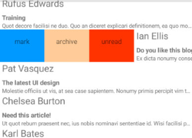
AndroidとiOSでのスワイプアクションの動作の例を次に示します。
図1:AndroidおよびiOSでのスワイプアクション機能の動作:
スワイプアクションを有効にする
「スワイプアクション」機能を有効にするには、まず "swipeActions" プロパティを trueに設定する必要があります。
例1:XMLでSwipeActionsを有効にする:
<lv:RadListView
	id="listView"
	items="{{ dataItems }}"
	selectionBehavior="None"
	itemSwipeProgressEnded="onSwipeCellFinished"
	itemSwipeProgressStarted="onSwipeCellStarted"
	itemSwipeProgressChanged="onSwipeCellProgressChanged"
	itemSwiping="onItemSwiping"
swipeActions="true">また、スワイプアクションイベントのハンドラーが用意されていることにも注意してください。これらのハンドラーを使用すると、スワイプされているアイテム、オフセット、およびユーザーがスワイプを終了したタイミングを確認できます。
次に、ユーザーがアイテムをスワイプしたときにユーザーに表示されるコンテンツを定義する必要があります。 これは、以下のXMLサンプルに示すように、 "itemSwipeTemplate" プロパティを介して行われます。
例2:XMLのテンプレートを介してスワイプアクションコンテンツを定義する:
<lv:RadListView.itemSwipeTemplate>
    <GridLayout columns="auto, *, auto" backgroundColor="White">
        <StackLayout id="mark-view" col="0" style="background-color: blue;" tap="onLeftSwipeClick" paddingLeft="16" paddingRight="16" orientation="horizontal">
            <Label text="mark" style="text-size: 20" verticalAlignment="center" horizontalAlignment="center"/>
        </StackLayout>
        <StackLayout id="delete-view" col="2" style="background-color: red;" tap="onRightSwipeClick"  paddingLeft="16" paddingRight="16" orientation="horizontal">
            <Label text="delete" style="text-size: 20" verticalAlignment="center" horizontalAlignment="center" />
        </StackLayout>
    </GridLayout>
</lv:RadListView.itemSwipeTemplate>スワイプテンプレートは3列のGridLayoutになります。 最初と最後の列にはそれぞれStackLayoutが含まれています。 これらの要素は、アイテムを左または右にスワイプすることによって表示されるアクションを表します。 中央の2列目は、2つのStackLayout要素がアイテムの両端に配置されるように、アイテムの残りの幅を取るように設定されています。
スワイプアクションの実装
スワイプアクションを実装する一般的な方法は2つあります。 最初のアプローチでは、スワイプしきい値を定義して、スワイプしたアイテムを特定の位置(スワイプ制限)に固定し、スワイプアクションを明らかにします。ユーザーは特定のアクションをタップして実行します。 2番目のアプローチでは、"itemSwipeProgressChangedEvent" イベントをリッスンし、スワイプされているアイテムが所定のしきい値に達したら、スワイプされたアイテムがリリースされたときに対応するアクションを実行します。 次の例は、これらのアプローチの実装方法を示しています。
タップして実行するアクション
このシナリオでは、ユーザーはアイテムをスワイプしてアクションを表示し、次にアイテムをタップして実行する必要があります。上記のXMLスニペットのスワイプテンプレートを使用してみましょう。
例3:タップして実行するシナリオで使用されるスワイプアクションテンプレート:
<lv:RadListView.itemSwipeTemplate>
    <GridLayout columns="auto, *, auto" backgroundColor="White">
        <StackLayout id="mark-view" col="0" style="background-color: blue;" tap="onLeftSwipeClick" paddingLeft="16" paddingRight="16" orientation="horizontal">
            <Label text="mark" style="text-size: 20" verticalAlignment="center" horizontalAlignment="center"/>
        </StackLayout>
        <StackLayout id="delete-view" col="2" style="background-color: red;" tap="onRightSwipeClick"  paddingLeft="16" paddingRight="16" orientation="horizontal">
            <Label text="delete" style="text-size: 20" verticalAlignment="center" horizontalAlignment="center" />
        </StackLayout>
    </GridLayout>
</lv:RadListView.itemSwipeTemplate>
実装する必要がある動作は次のとおりです。
- ユーザーがアイテムをスワイプ
- ユーザーがアイテムを離すと、アイテムが開いたままになり、アクションが表示されます
- ユーザーがアクションをタップすると、イベントハンドラーが呼び出され、スワイプされたアイテムが閉じます
そのためには、"itemSwipeProgressStartedEvent" イベントハンドラーを使用して、スワイプされたアイテムが固定される場所を決定するスワイプパラメーターを定義する必要があります。
例4:スワイプ距離を制限するためにitemSwipeProgressStartedEventを処理します。
export function onSwipeCellStarted(args: SwipeActionsEventData) {
	const swipeLimits = args.data.swipeLimits;
	const swipeView = args.object;
	const leftItem = swipeView.getViewById<View>('mark-view');
	const rightItem = swipeView.getViewById<View>('delete-view');
	swipeLimits.left = leftItem.getMeasuredWidth();
	swipeLimits.right = rightItem.getMeasuredWidth();
	swipeLimits.threshold = leftItem.getMeasuredWidth() / 2;
}args.data.swipeLimitsargs.data.swipeLimitsオブジェクト(この記事の最後にこのオブジェクトについての詳細があります)は、 アイテムが左右にスワイプできる距離や、スワイプされたアイテムが制限位置で開いた状態でドッキングするオフセットを決定するしきい値を定義するために使用できます。 この特定のシナリオでは、スワイプ制限は、左右のアクション要素の対応する幅に定義されています。 しきい値はその半分の幅と定義されています。 アクション要素の幅は同じなので、単純に左要素の幅を使用しています。
これで、スワイプして開いてアクションを表示できるアイテムのリストができました。 提供されたtapイベントハンドラーを使用して(上記のXMLスニペットに示されているように)、ユーザーが特定のアクションをタップして実行するタイミングを理解できるようになりました。
例5:スワイプアクションを処理します。
export function onLeftSwipeClick(args: ListViewEventData) {
    const listView = <RadListView>Frame.topmost().currentPage.getViewById("listView");
    console.log("Left swipe click");
    listView.notifySwipeToExecuteFinished();
}

export function onRightSwipeClick(args) {
    const listView = <RadListView>Frame.topmost().currentPage.getViewById("listView");
    console.log("Right swipe click");
    const viewModel: ViewModel = <ViewModel>listView.bindingContext;
    viewModel.dataItems.splice(viewModel.dataItems.indexOf(args.object.bindingContext), 1);
}スワイプアクション
このシナリオでは、ユーザーはアイテムをスワイプしてリリースし、対応するアクションを実行する必要があります。 関連するアクションが実行されるように、アイテムは指定されたしきい値を超えて所定の距離でスワイプする必要があります。 このアプローチを実装するには、次の"RadListView" イベントを処理する必要があります。
- "itemSwipeProgressStartedEvent" - アイテムが解放されたときに元の場所に戻るようにスワイプ制限を指定するために使用されます。
- "itemSwipeProgressEndedEvent" - スワイプアクションを実行する必要があるかどうかを決定するために使用されます(アイテムが特定のしきい値を超えてスワイプされた場合)。
- "itemSwipeProgressChangedEvent" - 指定したしきい値を超えてアイテムをスワイプしたことをユーザーに通知したい場合、スワイプアクションを実行します。
それでは、"itemSwipeProgressStartedEvent" イベントのハンドラーを見てみましょう。
例6:itemSwipeProgressStartedEventの処理:
export function onSwipeCellStarted(args: SwipeActionsEventData) {
	const swipeLimits = args.data.swipeLimits;
	const swipeView = args.swipeView;
	const leftItem = swipeView.getViewById('mark-view');
	const rightItem = swipeView.getViewById('delete-view');
	swipeLimits.left = swipeLimits.right = args.data.x > 0 ? swipeView.getMeasuredWidth() / 2 : swipeView.getMeasuredWidth() / 2;
	swipeLimits.threshold = swipeView.getMeasuredWidth();
}
リストコントロールの幅がしきい値の指定に使用されていることがわかります。左端と右端の制限は、 アイテムのサイズの半分になるように定義されています(この場合は、"itemSwipeTemplate"プロパティから 取得されるスワイプビューの幅の測定値を使用します)。つまり、ユーザーはしきい値を超えてスワイプできず、一度離すとアイテムは常に元の位置にドッキングされます。 したがって、残っているのは、"itemSwipeProgressEndedEvent" を使用して スワイプの進行状況を追跡し、スワイプされた アイテムがしきい値を超えたときにアクションをトリガーすることです。
例7:スワイプのしきい値を定義する:
export function onCellSwiping(args: SwipeActionsEventData) {
    const swipeLimits = args.data.swipeLimits;
    const swipeView = args.swipeView;
    const mainView = args.mainView;
    const leftItem = swipeView.getViewById<View>('mark-view');
    const rightItem = swipeView.getViewById<View>('delete-view');

    if (args.data.x > swipeView.getMeasuredWidth() / 4 && !leftThresholdPassed) {
        console.log("Notify perform left action");
        const markLabel = leftItem.getViewById<View>('mark-text');
        leftThresholdPassed = true;
    } else if (args.data.x < -swipeView.getMeasuredWidth() / 4 && !rightThresholdPassed) {
        const deleteLabel = rightItem.getViewById<View>('delete-text');
        console.log("Notify perform right action");
        rightThresholdPassed = true;
    }
    if (args.data.x > 0) {
        const leftDimensions = View.measureChild(
            <View>leftItem.parent,
            leftItem,
            layout.makeMeasureSpec(Math.abs(args.data.x), layout.EXACTLY),
            layout.makeMeasureSpec(mainView.getMeasuredHeight(), layout.EXACTLY));
        View.layoutChild(
            <View>leftItem.parent,
            leftItem,
            0, 0,
            leftDimensons.measuredWidth, leftDimensions.measuredHeight);
    } else {
        const rightDimensions = View.measureChild(
            <View>rightItem.parent,
            rightItem,
            layout.makeMeasureSpec(Math.abs(args.data.x), layout.EXACTLY),
            layout.makeMeasureSpec(mainView.getMeasuredHeight(), layout.EXACTLY));

        View.layoutChild(
            <View>rightItem.parent,
            rightItem,
            mainView.getMeasuredWidth() - rightDimensions.measuredWidth, 0,
            mainView.getMeasuredWidth(), rightDimensions.measuredHeight);
    }
}
この特定のケースでは、アクションが実行されたと見なされるしきい値は、アイテム全体の幅の1/4であると決定しました (この場合、"itemSwipeTemplate"プロパティから 取得されるスワイプビューの幅の測定値を使用します)。 ここでは、スワイプの方向ごとに2つのフラグを使用します。 スワイプされているアイテムのオフセットが選択されたしきい値(アイテムの幅の1/4)を超えると、フラグを上げて、どのアクションをトリガーにするかを判断するために "itemSwipeProgressEndedEvent" で使用しています。
例8:スワイプの方向に応じてスワイプアクションをトリガーする:
export function onSwipeCellFinished(args: SwipeActionsEventData) {
    const swipeView = args.swipeView;
    const leftItem = swipeView.getViewById('mark-view');
    const rightItem = swipeView.getViewById('delete-view');
    if (leftThresholdPassed) {
        console.log("Perform left action");
    } else if (rightThresholdPassed) {
        console.log("Perform right action");
    }
    leftThresholdPassed = false;
    rightThresholdPassed = false;
}
"RadListView" によって公開されるすべてのスワイプイベントは、 "ListViewEventData" オブジェクトを提供します。 このオブジェクトは、"data" プロパティを通じて "SwipeOffsets" オブジェクトを伝達します。 このオブジェクトは次のプロパティを公開します:
x- スワイプ後にリリースされるアイテムの X オフセットy- スワイプ後にリリースされるアイテムの Y オフセットswipeLimits- スワイプされたアイテムの移動を制限する寸法制限を含む"SwipeLimits" のインスタンス。 そのプロパティは次のとおりです。- top - 上端からどのくらいの距離までアイテムをスワイプできるかを決定します。
- left - 左端からどのくらいの距離までアイテムをスワイプできるかを指定します。
- right - 右端からどのくらいの距離までアイテムをスワイプできるかを指定します。
- bottom - 下端からどのくらいの距離までアイテムをスワイプできるかを決定します。
- threshold - 指定されたスワイプリミット(左または右)でアイテムが開くように、任意のスワイプ方向で超えなければならないピクセルの量を決定します。
swipeView- スワイプされているアイテムの下のスワイプコンテンツを表すView要素mainView- スワイプされているアイテムのメインコンテンツを表すView要素
スワイプ中のアクションビューのアニメーション化
「スワイプアクション」を実装する多くのモバイルアプリは、ユーザーがスワイプしている間もアクションビューをアニメーション化します。 これは、"itemSwipeProgressChangedEvent" イベントで簡単に実現できます。 次のスワイプテンプレートを考えてみましょう。
例9:複数のアクションを持つスワイプアクションテンプレートの定義:
<lv:RadListView.itemSwipeTemplate>
    <GridLayout columns="auto, *, auto">
        <GridLayout columns="*, *, *" col="0" id="left-stack">
            <GridLayout col="0" style="background-color: #0099ff;" tap="onLeftSwipeClick" id="btnMark" padding="16" >
                <Label text="mark" fontSize="15" verticalAlignment="center" horizontalAlignment="center"/>
            </GridLayout>
             <GridLayout col="1" style="background-color: #ffcc99;" tap="onLeftSwipeClick" id="btnArchive" padding="16">
                <Label text="archive" fontSize="15" verticalAlignment="center" horizontalAlignment="center"/>
            </GridLayout>
             <GridLayout col="2" style="background-color:  #ff3300;" tap="onLeftSwipeClick" id="btnUnread" padding="16">
                <Label text="unread" fontSize="15" verticalAlignment="center" horizontalAlignment="center"/>
            </GridLayout>
        </GridLayout>
        <GridLayout columns="*, *, *" col="2" id="right-stack">
            <GridLayout col="0" style="background-color: red;" tap="onRightSwipeClick" id="btnDelete" padding="16" >
                <Label text="delete" fontSize="15" verticalAlignment="center" horizontalAlignment="center"/>
            </GridLayout>
            <GridLayout col="1" style="background-color: #ff66ff;" tap="onRightSwipeClick" id="btnRead" padding="16">
                <Label text="read" fontSize="15" verticalAlignment="center" horizontalAlignment="center"/>
            </GridLayout>
            <GridLayout col="2" style="background-color: #9966ff;" tap="onRightSwipeClick" id="btnForward" padding="16">
                <Label text="forward" fontSize="15" verticalAlignment="center" horizontalAlignment="center"/>
            </GridLayout>
        </GridLayout>
    </GridLayout>
</lv:RadListView.itemSwipeTemplate>ご覧のとおり、GridLayoutインスタンスが最上位にあり、上記のシナリオと同様に、3つの列を定義しています。 そのうちの2つは、さらに2つのGridLayoutインスタンスによって構成されます。 ネストされたインスタンスは、幅が均等に分散された3つの列を持つように設定されています。 ネストされた各GridLayout要素には、スワイプアクションを表す3つのStackLayout要素が定義されています。 次に、"itemSwipeProgressChangedEvent" を使用して、 第2レベルのGridLayout要素をアニメーション化し、独自のレイアウトでStackLayoutインスタンスのサイズを自動的に計算します。
例10:スワイプ中にスワイプアクションコンテンツをアニメーション化する:
export function onCellSwiping(args: SwipeActionsEventData) {
    const swipeLimits = args.data.swipeLimits;
    const swipeView = args.swipeView;
    mainView = args.mainView;
    leftItem = swipeView.getViewById<View>('left-stack');
    rightItem = swipeView.getViewById<View>('right-stack');

    if (args.data.x > 0) {
        const leftDimensions = View.measureChild(
            <View>leftItem.parent,
            leftItem,
            layout.makeMeasureSpec(Math.abs(args.data.x), layout.EXACTLY),
            layout.makeMeasureSpec(mainView.getMeasuredHeight(), layout.EXACTLY));

        View.layoutChild(<View>leftItem.parent,
            leftItem,
            0, 0,
            leftDimensions.measuredWidth, leftDimensions.measuredHeight);
        hideOtherSwipeTemplateView("left");
    } else {
        const rightDimensions = View.measureChild(
            <View>rightItem.parent,
            rightItem,
            layout.makeMeasureSpec(Math.abs(args.data.x), layout.EXACTLY),
            layout.makeMeasureSpec(mainView.getMeasuredHeight(), layout.EXACTLY));

        View.layoutChild(<View>rightItem.parent,
            rightItem,
            mainView.getMeasuredWidth() - rightDimensions.measuredWidth, 0,
            mainView.getMeasuredWidth(), rightDimensions.measuredHeight);
        hideOtherSwipeTemplateView("right");
    }
}

function hideOtherSwipeTemplateView(currentSwipeView: string) {
    switch (currentSwipeView) {
        case "left":
            if (rightItem.getActualSize().width !== 0) {
                View.layoutChild(<View>rightItem.parent, rightItem, mainView.getMeasuredWidth(), 0, mainView.getMeasuredWidth(), 0);
            }
            break;
        case "right":
            if (leftItem.getActualSize().width !== 0) {
                View.layoutChild(<View>leftItem.parent, leftItem, 0, 0, 0, 0);
            }
            break;
        default:
            break;
    }
}ここで行うことは、ユーザーが選択したスワイプの方向を確認し、特定のGridLayoutspan>(左または右)のレイアウトをトリガーして、スワイプされているアイテムの下に表示されるスペースを動的に取得することです。 UXを改善するために、スワイプオフセットの制限としきい値を定義しました。 しきい値を超えると、アイテムが固定され、すべてのスワイプアクションが表示されます。
例11:スワイプの制限としきい値を適用してスワイプ動作を調整する:
export function onSwipeCellStarted(args: SwipeActionsEventData) {
const swipeLimits = args.data.swipeLimits;
swipeLimits.threshold = args.mainView.getMeasuredWidth() * 0.2; // 20% of whole width
swipeLimits.left = swipeLimits.right = args.mainView.getMeasuredWidth() * 0.65; // 65% of whole width
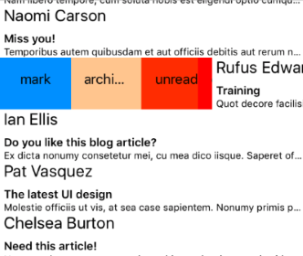
}AndroidとiOSでの動作を示す2つのスクリーンショットを次に示します。
図2:視覚化された複数のスワイプアクション:
参考文献
このシナリオを実際に見てみたいですか? GitHubのSDKサンプルリポジトリを確認してください。これとNativeScript UIを使用した他の多くの実用的な例があります。