ユーザーインターフェイスレイアウトコンテナ
AbsoluteLayout
AbsoluteLayoutは、NativeScriptで最もシンプルなレイアウトです。 左上の絶対座標を使用して子を配置します。 AbsoluteLayoutは、子にレイアウトコンテナを適用せず、実行時に親のサイズが変更された時も子のリサイズを行いません。
AbsoluteLayoutプロパティ
無し。
子のプロパティ
| プロパティ | 説明 |
|---|---|
| left | 子の左端と、その親のAbsoluteLayoutクライアント領域の左端の間の距離を、ピクセル単位で取得または設定します。 |
| top | 子の上端と、その親AbsoluteLayoutクライアント領域の上端の間の距離を、ピクセル単位で取得または設定します。 |
<Page xmlns="http://schemas.nativescript.org/tns.xsd">
	<AbsoluteLayout width="210" height="210" backgroundColor="lightgray">
		<Label text="10, 10" left="10" top="10" width="90" height="90" backgroundColor="red"/>
		<Label text="110, 10" left="110" top="10" width="90" height="90" backgroundColor="green"/>
		<Label text="110, 110" left="110" top="110" width="90" height="90" backgroundColor="blue"/>
		<Label text="10, 110" left="10" top="110" width="90" height="90" backgroundColor="yellow"/>
	</AbsoluteLayout>
</Page>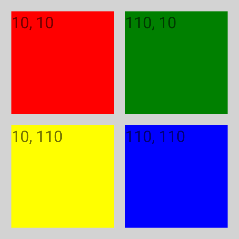
<Page xmlns="http://schemas.nativescript.org/tns.xsd">
	<AbsoluteLayout width="210" height="210" backgroundColor="lightgray">
		<Label text="no margin" left="10" top="10" width="100" height="100" backgroundColor="red"/>
		<Label text="margin='30'" left="10" top="10" margin="30" width="100" height="90" backgroundColor="green"/>
	</AbsoluteLayout>
</Page>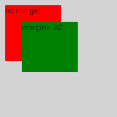
DockLayout
DockLayoutは、レイアウトの左、右、上、下、または中央への子要素のドッキングメカニズムを提供するレイアウトです。 子要素のドッキング面を定義するには、dockプロパティを使用します。 子要素をDockLayoutの中央にドッキングするには、それがDockLayoutの最後の子であり、 DockLayoutのstretchLastChildプロパティがtrueに設定されている必要があります。
DockLayoutプロパティ
| プロパティ | 説明 |
|---|---|
| stretchLastChild | DockLayout内の最後の子要素が、残りの利用可能なスペースを埋めるために、伸びるかどうかを示す値を取得または設定します。デフォルト値はtrueです。 |
子のプロパティ
| プロパティ | 説明 |
|---|---|
| dock | DockLayout内にある子要素のDock位置を指定します。指定可能な値はleft、top、right、bottomです。 |
stretchLastChild="false"の例
<Page xmlns="http://schemas.nativescript.org/tns.xsd">
	<DockLayout width="210" height="210" backgroundColor="lightgray" stretchLastChild="false">
		<Label text="left" dock="left" width="60" backgroundColor="red"/>
		<Label text="top" dock="top" height="60" backgroundColor="green"/>
		<Label text="right" dock="right" width="60" backgroundColor="blue"/>
		<Label text="bottom" dock="bottom" height="60" backgroundColor="yellow"/>
	</DockLayout>
</Page>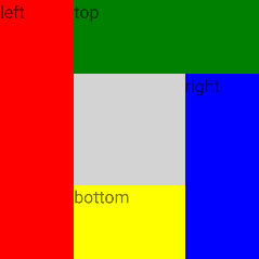
stretchLastChild="true"の例
<Page xmlns="http://schemas.nativescript.org/tns.xsd">
	<DockLayout width="210" height="210" backgroundColor="lightgray" stretchLastChild="true">
		<Label text="left" dock="left" backgroundColor="red"/>
		<Label text="top" dock="top" backgroundColor="green"/>
		<Label text="right" dock="right" backgroundColor="blue"/>
		<Label text="bottom" dock="bottom" backgroundColor="yellow"/>
	</DockLayout>
</Page>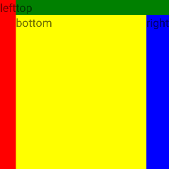
片側に複数の子要素がある例
<Page xmlns="http://schemas.nativescript.org/tns.xsd">
	<DockLayout width="210" height="210" backgroundColor="lightgray" stretchLastChild="true">
		<Label text="left1" dock="left" backgroundColor="red"/>
		<Label text="left2" dock="left" backgroundColor="green"/>
		<Label text="left3" dock="left" backgroundColor="blue"/>
		<Label text="last child" backgroundColor="yellow"/>
	</DockLayout>
</Page>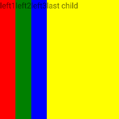
GridLayout
GridLayoutは、子要素を行と列のテーブル構造に配置するレイアウトです。 セルには複数の子要素を含めることができ、複数の行と列にまたがることができ、互いに重なり合うことさえできます。 GridLayoutには、デフォルトで1つの列と1つの行があります。 列と行を追加するには、GridLayoutのcolumnsプロパティに列定義項目(カンマで区切られた)を指定し、行定義項目(カンマで区切られた)にrowsプロパティを指定する必要があります。 列の幅と行の高さは、ピクセルの絶対量、使用可能なスペースの割合、自動的、に指定できます。
- 絶対量:固定のピクセル数
- アスタリスク(*):使用可能な限りのスペースを取り(すべての自動サイズと固定サイズの列を埋めた後)、すべてのアスタリスクサイズの列に比例して分割します。例えば、3/7 は 30/70 と同じ意味になります。
- 自動:含まれている子要素が必要とするだけのスペースを取ります。
GridLayoutプロパティ
| プロパティ | 説明 |
|---|---|
| columns |
コンマで区切られた列幅を表す文字列値。
列幅は、数値、auto または * のどちらか、です。
数値は列の絶対幅を示し、auto は列を最も広い子と同じ幅にし、* は列が使用可能なすべての横幅を占めるようにします。
|
| rows |
コンマで区切られた行の高さを表す文字列値。
行の高さは、数値、auto または * のどちらか、です。
数値は行の絶対的な高さを示し、auto は行を最も高い子と同じ高さにし、* は行が使用可能なすべての高さを占めるようにします。
|
子のプロパティ
| プロパティ | 説明 |
|---|---|
| row | GridLayout内の、どの行の子コンテンツを表示するかを示す値を、取得または設定します。 |
| col | GridLayout内の、どの列の子コンテンツを表示するかを示す値を、取得または設定します。 |
| rowSpan | GridLayout内で、子コンテンツがまたがる行の総数を示す値を、取得または設定します。 |
| colSpan | GridLayout内で、子コンテンツがまたがる列の総数を示す値を、取得または設定します。 |
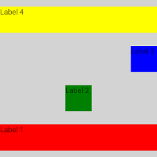
基本的なグリッドの使用例
<Page xmlns="http://schemas.nativescript.org/tns.xsd">
	<GridLayout columns="50, auto, *" rows="50, auto, *" width="210" height="210" backgroundColor="lightgray" >
		<Label text="Label 1" row="0" col="0" backgroundColor="red"/>
		<Label text="Label 2" row="0" col="1" colSpan="2" backgroundColor="green"/>
		<Label text="Label 3" row="1" col="0" rowSpan="2" backgroundColor="blue"/>
		<Label text="Label 4" row="1" col="1" backgroundColor="yellow"/>
		<Label text="Label 5" row="1" col="2" backgroundColor="orange"/>
		<Label text="Label 6" row="2" col="1" backgroundColor="pink"/>
		<Label text="Label 7" row="2" col="2" backgroundColor="purple"/>
	</GridLayout>
</Page>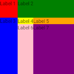
アスタリスク(*)を使用したサイジングの例
- Columns:1つ星に2つ星を加えたものは、3つ星に相当します(* + 2* = 3*)。 GridLayoutの幅(300)を3で除算して100を取得します。 したがって、最初の列は幅 1 x 100 = 100 ピクセルで、2番目の列は幅 2 x 100 = 200 ピクセルです。 100 + 200 = 300。
- Rows:2つの星と3つの星は5つの星に相当します(2* + 3* = 5*)。 GridLayoutの高さ(300)を5で除算して60を取得します。 したがって、最初の行は 2 x 60 = 120 ピクセルの高さで、2番目の行は 3 x 60 = 180 ピクセルの高さです。 120 + 180 = 300。
<Page xmlns="http://schemas.nativescript.org/tns.xsd">
	<GridLayout columns="*,2*" rows="2*,3*" width="300" height="300" backgroundColor="lightgray" >
		<Label text="Label 1" col="0" row="0" backgroundColor="red"/>
		<Label text="Label 2" col="1" row="0" backgroundColor="green"/>
		<Label text="Label 3" col="0" row="1" backgroundColor="blue"/>
		<Label text="Label 4" col="1" row="1" backgroundColor="yellow"/>
	</GridLayout>
</Page>
固定および自動サイズ設定の例
- 最初の列と最初の行は、それぞれ100と100の固定サイズです。それらは、子供の寸法に関係なく、まさにこの幅/高さになります。子供がいなくても、この幅/高さのままです。
- 2列目と2行目はautoです。これは、利用可能な最大のスペースで測定され、コンテンツに合わせてサイズが調整されることを意味します。
<Page xmlns="http://schemas.nativescript.org/tns.xsd">
	<GridLayout columns="100,auto" rows="100,auto" width="210" height="210" backgroundColor="lightgray" >
		<Label text="Label 1" col="0" row="0" backgroundColor="red"/>
		<Label text="Label 2" col="1" row="0" backgroundColor="green"/>
		<Label text="Label 3" col="0" row="1" backgroundColor="blue"/>
		<Label text="Label 4" col="1" row="1" backgroundColor="yellow"/>
	</GridLayout>
</Page>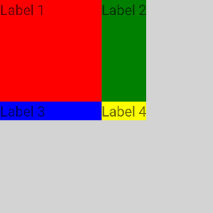
幅なしおよびhorizontalAlignment!= stretchの例
GridLayoutに明示的なwidthが設定されておらず、horizontalAlignmentが設定されていてstretchでない場合、 アスタリスク列は使用可能なスペース全体(親StackLayoutの200)を占有しません。
<Page xmlns="http://schemas.nativescript.org/tns.xsd">
	<StackLayout width="200" height="200" backgroundColor="palegreen">
		<GridLayout columns="*,2*" horizontalAlignment="left" verticalAlignment="top" backgroundColor="lightgray">
			<Label text="Label 1" col="0" backgroundColor="red"/>
			<Label text="Label 2" col="1" backgroundColor="green"/>
		</GridLayout>
	</StackLayout>
</Page>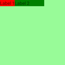
列のストレッチの例
ラベル3の幅は150ピクセルに固定されています。ラベル3によりauto列が引き伸ばされるため、ラベル1には実際に必要なスペースよりも多くのスペースが与えられます。
<Page xmlns="http://schemas.nativescript.org/tns.xsd">
	<GridLayout columns="auto,100" rows="auto,auto" width="300" height="300" backgroundColor="lightgray" >
		<Label text="Label 1" col="0" row="0" backgroundColor="red"/>
		<Label text="Label 2" col="1" row="0" backgroundColor="green"/>
		<Label text="Label 3" width="150" col="0" row="1" backgroundColor="blue"/>
	</GridLayout>
</Page>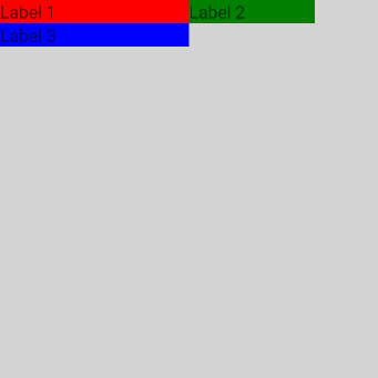
複雑な構造の例
Image幅と高さが72に固定されており、両方の行にまたがっています。
最初のLabelは、colSpan="2" を使用してより多くのスペースが与えられます。
2番目のLableは、3番目のLabelが自動列を調整するために、実際に必要なスペースよりも多くのスペースが与えられます。
<Page xmlns="http://schemas.nativescript.org/tns.xsd">
	<GridLayout columns="auto, *, auto" rows="auto, 25" verticalAlignment="top" backgroundColor="lightgray">
		<Image src="~/cute.jpg" rowSpan="2" width="72" height="72" margin="3" verticalAlignment="top"/>
		<Label text="My cat loves the camera" textWrap="true" col="1" colSpan="2" minHeight="50" fontSize="20" margin="3"/>
		<Label text="John Smith" col="1" row="1" fontSize="14" horizontalAlignment="left" verticalAlignment="bottom" margin="3"/>
		<Label text="comments: 26" col="2" row="1" color="#10C2B0" fontSize="14" verticalAlignment="bottom" margin="3"/>
	</GridLayout>
</Page>
コードビハインドを介してグリッドを動的に作成する例
<Page loaded="onPageLoaded" xmlns="http://schemas.nativescript.org/tns.xsd">

</Page>
const Color = require("tns-core-modules/color").Color;
const Button = require("tns-core-modules/ui/button").Button;
const Label = require("tns-core-modules/ui/label").Label;
const layout = require("tns-core-modules/ui/layouts/grid-layout");
const [GridLayout, GridUnitType, ItemSpec] = [layout.GridLayout, layout.GridUnitType, layout.ItemSpec];
function onPageLoaded(args) {
// Grid wrapper
const grid = new GridLayout();
// Create title Label and add it as a child to our grid
const titleLabel = new Label();
titleLabel.text = "NativeScript";
grid.addChild(titleLabel);
// Create info Label and add it as a child to our grid
const infoLabel = new Label();
infoLabel.text = "Truly native mobile apps";
infoLabel.backgroundColor = new Color("gray");
grid.addChild(infoLabel);
// Create the share Button and add it as a child to our grid
const shareButton = new Button();
shareButton.text = "Share This!";
grid.addChild(shareButton);
// Add Grid Rows as if rows="*, 100, auto" cols="250, *"
// * - occupy the remaining available space
grid.addRow(new ItemSpec(1, GridUnitType.STAR));
// 100 - fixed column width.
// If elements in this row need more vertical space - we will coerce their height to the row height.
grid.addRow(new ItemSpec(100, GridUnitType.PIXEL));
// auto - the row height will be the height of the tallest element in that row.
grid.addRow(new ItemSpec(1, GridUnitType.AUTO));
grid.addColumn(new ItemSpec(250, GridUnitType.PIXEL));
grid.addColumn(new ItemSpec(1, GridUnitType.STAR));
// Assign views to their row (if not set default row is 0)
GridLayout.setRow(titleLabel, 0); // titleLabel set to row 0
GridLayout.setRow(infoLabel, 1); // infoLabel set to row 1
GridLayout.setRow(shareButton, 2); // shareButton set to row 2
// Assign views to their col (if not set default column is 0)
GridLayout.setColumn(titleLabel, 0); // titleLabel set to column 0
GridLayout.setColumn(infoLabel, 0); // infoLabel set to column 0
GridLayout.setColumn(shareButton, 1); // shareButton set to column 1
// Assign ColumnSpan for views
GridLayout.setColumnSpan(infoLabel, 2); // infoLabel set with columnSpan = 2
const page = args.object;
page.content = grid;
}
exports.onPageLoaded = onPageLoaded;import { Color } from "tns-core-modules/color";
import { EventData } from "tns-core-modules/data/observable";
import { Button } from "tns-core-modules/ui/button";
import { Label } from "tns-core-modules/ui/label";
import { GridLayout, GridUnitType, ItemSpec } from "tns-core-modules/ui/layouts/grid-layout";
import { Page } from "tns-core-modules/ui/page";
export function onPageLoaded(args: EventData) {
// Grid wrapper
const grid = new GridLayout();
// Create title Label and add it as a child to our grid
const titleLabel = new Label();
titleLabel.text = "NativeScript";
grid.addChild(titleLabel);
// Create info Label and add it as a child to our grid
const infoLabel = new Label();
infoLabel.text = "Truly native mobile apps";
infoLabel.backgroundColor = new Color("gray");
grid.addChild(infoLabel);
// Create the share button and add it as a child to our grid
const shareButton = new Button();
shareButton.text = "Share This!";
grid.addChild(shareButton);
// Add Grid Rows as if rows="*, 100, auto" cols="250, *"
// * - occupy the remaining available space
grid.addRow(new ItemSpec(1, GridUnitType.STAR));
// 100 - fixed column width.
// If elements in this row need more vertical space - we will coerce their height to the row height.
grid.addRow(new ItemSpec(100, GridUnitType.PIXEL));
// auto - the row height will be the height of the tallest element in that row.
grid.addRow(new ItemSpec(1, GridUnitType.AUTO));
grid.addColumn(new ItemSpec(250, GridUnitType.PIXEL));
grid.addColumn(new ItemSpec(1, GridUnitType.STAR));
// Assign views to their row (if not set default row is 0)
GridLayout.setRow(titleLabel, 0); // titleLabel set to row 0
GridLayout.setRow(infoLabel, 1); // infoLabel set to row 1
GridLayout.setRow(shareButton, 2); // shareButton set to row 2
// Assign views to their col (if not set default column is 0)
GridLayout.setColumn(titleLabel, 0); // titleLabel set to column 0
GridLayout.setColumn(infoLabel, 0); // infoLabel set to column 0
GridLayout.setColumn(shareButton, 1); // shareButton set to column 1
// Assign ColumnSpan for views
GridLayout.setColumnSpan(infoLabel, 2); // infoLabel set with columnSpan = 2
const page = <Page>args.object;
page.content = grid;
}StackLayout
StackLayoutは、その方向に応じて、子要素を下または横に積み重ねます。リストを作成する際に非常に便利です。
StackLayoutプロパティ
| プロパティ | 説明 |
|---|---|
| orientation | 子アイテムを水平方向または垂直方向に積み重ねるかどうかを示す値を取得または設定します。 可能な値はverticalとhorizontalで、デフォルト値はverticalです。 |
子のプロパティ
無し。
orientation="vertical"の例
<Page xmlns="http://schemas.nativescript.org/tns.xsd">
	<StackLayout orientation="vertical" width="210" height="210" backgroundColor="lightgray">
		<Label text="Label 1" width="50" height="50" backgroundColor="red"/>
		<Label text="Label 2" width="50" height="50" backgroundColor="green"/>
		<Label text="Label 3" width="50" height="50" backgroundColor="blue"/>
		<Label text="Label 4" width="50" height="50" backgroundColor="yellow"/>
	</StackLayout>
</Page>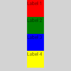
orientation="horizontal"の例
<Page xmlns="http://schemas.nativescript.org/tns.xsd">
	<StackLayout orientation="horizontal" width="210" height="210" backgroundColor="lightgray">
		<Label text="Label 1" width="50" height="50" backgroundColor="red"/>
		<Label text="Label 2" width="50" height="50" backgroundColor="green"/>
		<Label text="Label 3" width="50" height="50" backgroundColor="blue"/>
		<Label text="Label 4" width="50" height="50" backgroundColor="yellow"/>
	</StackLayout>
</Page>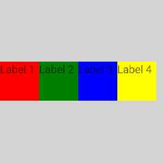
子の水平方向の配置の例
<Page xmlns="http://schemas.nativescript.org/tns.xsd">
	<StackLayout orientation="vertical" width="210" height="210" backgroundColor="lightgray">
		<Label text="Label 1" horizontalAlignment="left" backgroundColor="red"/>
		<Label text="Label 2" horizontalAlignment="center" backgroundColor="green"/>
		<Label text="Label 3" horizontalAlignment="right" backgroundColor="blue"/>
		<Label text="Label 4" horizontalAlignment="stretch" backgroundColor="yellow"/>
	</StackLayout>
</Page>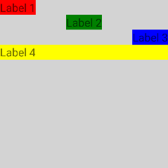
子の垂直方向の配置の例
<Page xmlns="http://schemas.nativescript.org/tns.xsd">
	<StackLayout orientation="horizontal" width="210" height="210" backgroundColor="lightgray">
		<Label text="Label 1" verticalAlignment="top" backgroundColor="red"/>
		<Label text="Label 2" verticalAlignment="center" backgroundColor="green"/>
		<Label text="Label 3" verticalAlignment="bottom" backgroundColor="blue"/>
		<Label text="Label 4" verticalAlignment="stretch" backgroundColor="yellow"/>
	</StackLayout>
</Page>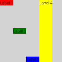
WrapLayout
WrapLayoutはStackLayoutと似ていますが、すべての子要素を1つの列/行にスタックするだけでなく、スペースが残っていない場合は新しい列/行にラップします。 WrapLayoutは同じサイズのアイテムでよく使用されますが、これは要件ではありません。
WrapLayoutプロパティ
| プロパティ | 説明 |
|---|---|
| orientation | 配置の方向を示す値を取得または設定します。orientationがhorizontalの場合、アイテムは水平方向に配置されます。 orientationがverticalの場合、アイテムは垂直方向に配置されます。デフォルト値はhorizontalです。 |
| itemWidth | 子の測定とレイアウトに使用される幅を取得または設定します。デフォルト値は Number.NaN で、子を制限しません。 |
| itemHeight | 子の測定とレイアウトに使用される高さを取得または設定します。デフォルト値は Number.NaN で、子を制限しません。 |
子のプロパティ
無し。
orientation="horizontal"の例
<Page xmlns="http://schemas.nativescript.org/tns.xsd">
	<WrapLayout orientation="horizontal" width="210" height="210" backgroundColor="lightgray">
		<Label text="Label 1" width="70" height="70" backgroundColor="red"/>
		<Label text="Label 2" width="70" height="70" backgroundColor="green"/>
		<Label text="Label 3" width="70" height="70" backgroundColor="blue"/>
		<Label text="Label 4" width="70" height="70" backgroundColor="yellow"/>
	</WrapLayout>
</Page>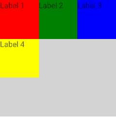
orientation="vertical"の例
<Page xmlns="http://schemas.nativescript.org/tns.xsd">
	<WrapLayout orientation="vertical" width="210" height="210" backgroundColor="lightgray">
		<Label text="Label 1" width="70" height="70" backgroundColor="red"/>
		<Label text="Label 2" width="70" height="70" backgroundColor="green"/>
		<Label text="Label 3" width="70" height="70" backgroundColor="blue"/>
		<Label text="Label 4" width="70" height="70" backgroundColor="yellow"/>
	</WrapLayout>
</Page>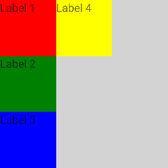
itemWidth="30"とitemHeight="30"の例
<Page xmlns="http://schemas.nativescript.org/tns.xsd">
	<WrapLayout itemWidth="30" itemHeight="30" width="210" height="210" backgroundColor="lightgray">
		<Label text="Label 1" width="70" height="70" backgroundColor="red"/>
		<Label text="Label 2" width="70" height="70" backgroundColor="green"/>
		<Label text="Label 3" width="70" height="70" backgroundColor="blue"/>
		<Label text="Label 4" width="70" height="70" backgroundColor="yellow"/>
	</WrapLayout>
</Page>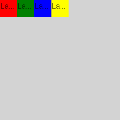
FlexboxLayout
FlexboxLayoutは、既存のApache-2ライセンスフレックスボックス実装に基づいた、CSS Flexible Box Layout の非準拠実装であり、 github.com/google/flexbox-layout でホストされています。
FlexboxLayoutプロパティ
| プロパティ | 説明 |
|---|---|
| flexDirection | フレックスアイテムがフレックスコンテナに配置される方向を示す値を取得または設定します。
flexDirectionプロパティは、以下の4つの異なる値を受け入れます。
rowです。
|
| flexWrap | フレックスアイテムを1行で強制するか、複数行にフローできるかを示す値を取得または設定します。
複数行に設定されている場合、新しい行のスタック方向を決定するクロス軸も定義します。
flexWrapプロパティは、3つの異なる値を受け入れます。
nowrap です。
|
| justifyContent | メイン軸に沿った配置を示す値を取得または設定します。
ライン上のすべてのフレックスアイテムに柔軟性がないか、柔軟性があるが最大サイズに達した場合に、余分な空きスペースを分散するのに役立ちます。
また、アイテムが行をオーバーフローするときに、アイテムの配置をある程度制御します。
justifyContentプロパティは5つの異なる値を受け入れます。
flex-start です。
|
| alignItems | 現在の行の交差軸に沿ってフレックスアイテムをレイアウトする方法を示す値を取得または設定します。
クロス軸(主軸に垂直)のjustifyContentバージョンと考えることができます。
alignItemsプロパティは5つの異なる値を受け入れます。
stretch です。
|
| alignContent | justifyContentがメイン軸内の個々のアイテムを整列する方法と同様に、クロス軸に余分なスペースがある場合に、フレックスコンテナーの行を整列させるのに役立つ値を取得または設定します。
alignContentプロパティは、6つの異なる値を受け入れます。
stretch です。
フレックスボックスに1行しかない場合、このプロパティは効果がありません。
|
子のプロパティ
| プロパティ | 説明 |
|---|---|
| order | フレックスアイテムのデフォルトの方向を取得または設定します。 |
| flexGrow | フレックスアイテムが必要に応じて成長できるかどうかを示す割合として機能する単位なしの値を取得または設定します。 アイテムが占有するフレックスコンテナ内の利用可能なスペースの量を指定します。 |
| flexShrink | 「flex shrink factor」を示す値を取得または設定します。 この値は、行に十分なスペースがない場合に、フレックスコンテナー内の残りのフレックスアイテムに対してフレックスアイテムがどれだけ縮小するかを決定します。 省略すると 1 に設定され、マイナスのスペースを分配する際、フレックス収縮率にフレックス基底が乗算されます。 |
| alignSelf | 特定のフレックスアイテムのalignItems値をオーバーライドできるようにする値を取得または設定します。
このプロパティは、alignItemsと同じ5つの値を受け入れます。
stretchです。
|
| flexWrapBefore | アイテムのラッピングを制御するブール値を取得または設定します。 フレックスボックスアイテムでtrueを設定すると、強制的に新しい行で折り返されます。 デフォルト値はfalseです。このプロパティは、公式のflexbox仕様の一部ではありません。 |
flexDirection="row", alignItems="stretch"の例(デフォルト)
<Page xmlns="http://schemas.nativescript.org/tns.xsd">
	<FlexboxLayout width="300" height="300" backgroundColor="lightgray">
		<Label text="Label 1" width="70" height="70" backgroundColor="red"/>
		<Label text="Label 2" width="70" height="70" backgroundColor="green"/>
		<Label text="Label 3" width="70" height="70" backgroundColor="blue"/>
		<Label text="Label 4" width="70" height="70" backgroundColor="yellow"/>
	</FlexboxLayout>
</Page>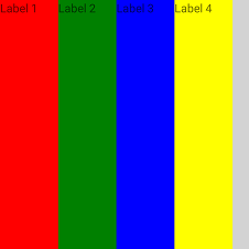
flexDirection="column", alignItems="stretch"の例(デフォルト)
<Page xmlns="http://schemas.nativescript.org/tns.xsd">
	<FlexboxLayout flexDirection="column" width="300" height="300" backgroundColor="lightgray">
		<Label text="Label 1" width="70" height="70" backgroundColor="red"/>
		<Label text="Label 2" width="70" height="70" backgroundColor="green"/>
		<Label text="Label 3" width="70" height="70" backgroundColor="blue"/>
		<Label text="Label 4" width="70" height="70" backgroundColor="yellow"/>
	</FlexboxLayout>
</Page>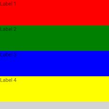
flexDirection="row", alignItems="flex-start"の例
<Page xmlns="http://schemas.nativescript.org/tns.xsd">
	<FlexboxLayout alignItems="flex-start" width="300" height="300" backgroundColor="lightgray">
		<Label text="Label 1" width="70" height="70" backgroundColor="red"/>
		<Label text="Label 2" width="70" height="70" backgroundColor="green"/>
		<Label text="Label 3" width="70" height="70" backgroundColor="blue"/>
		<Label text="Label 4" width="70" height="70" backgroundColor="yellow"/>
	</FlexboxLayout>
</Page>
flexDirection="row"の例、カスタムオーダー
<Page xmlns="http://schemas.nativescript.org/tns.xsd">
	<FlexboxLayout alignItems="flex-start" width="300" height="300" backgroundColor="lightgray">
		<Label order="3" text="Label 1" width="70" height="70" backgroundColor="red"/>
		<Label order="4" text="Label 2" width="70" height="70" backgroundColor="green"/>
		<Label order="2" text="Label 3" width="70" height="70" backgroundColor="blue"/>
		<Label order="1" text="Label 4" width="70" height="70" backgroundColor="yellow"/>
	</FlexboxLayout>
</Page>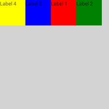
flexWrap="wrap"の例
<Page xmlns="http://schemas.nativescript.org/tns.xsd">
	<FlexboxLayout flexWrap="wrap" height="300" width="300" backgroundColor="lightgray">
		<Label text="Label 1" width="100" height="50" backgroundColor="red"/>
		<Label text="Label 2" width="100" height="50" backgroundColor="green"/>
		<Label text="Label 3" width="100" height="50" backgroundColor="blue"/>
		<Label text="Label 4" width="100" height="50" backgroundColor="yellow"/>
	</FlexboxLayout>
</Page>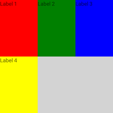
flexDirection="column-reverse", justifyContent="space-around", alignItems="stretch"の例
<Page xmlns="http://schemas.nativescript.org/tns.xsd">
	<FlexboxLayout flexDirection="column-reverse" justifyContent="space-around" alignItems="stretch"
		height="300" width="300" backgroundColor="lightgray">
		<Label text="Label 1" width="50" height="50" backgroundColor="red"/>
		<Label alignSelf="center" text="Label 2" width="50" height="50" backgroundColor="green"/>
		<Label alignSelf="flex-end" text="Label 3" width="50" height="50" backgroundColor="blue"/>
		<Label text="Label 4" width="50" height="50" backgroundColor="yellow"/>
	</FlexboxLayout>
</Page>